08 July 2018
Pure CSS Progress Circles
Progress elements can be usefull in alot of different situations. Showing them as loading indicators, using them as part of a task flow or for data visualization.
Let’s start by creating the html:
<div class="player">
  <div class="player-icon"></div>
  <div class="progress">
    <div class="right-side"></div>
    <div class="left-side"></div>
  </div>
  <div class="player-text"></div>
  <div class="player-title"></div>
</div>
Now let’s add some CSS:
*,
*::before,
*::after {
    box-sizing: border-box;
}

body {
    margin: 0;
    font-family: sans-serif, Arial, Helvetica;
}

.player {
    width: 100px;
    height: 100px;
    background: #eee;
    position: relative;
    border-radius: 50%;
    overflow: visible;
    margin: 80px auto;
}

.player:hover {
    opacity: .8;
}

.player-text {
  position: absolute;
  left: 50%;
  top: 50%;
  transform: translate(-50%, -50%);
  color: #4beade;
  font-weight: 700;
  font-size: 20px;
}

.player-title {
    position: absolute;
    left: 0; right: 0;
    top: calc(50% + 55px);
    text-align: center;
    color: #999;
}
Next we have to create a round border on the element with a variable circumference. Using a few tricks this can be achieved whith pure CSS. We need to halfs of a circle, a left side and a right side. If the progress is less than 50% we rotate the left side over the right side and give the left side the same color as the background. This allows us to hide the right side and show values from 0% to 50%. To show values above 50%. We chage the color of the left side to the color of the progress circle and do essentially the same thing as before only now we are extending the other circle from 50% to a 100%.
.left-side {
    position: absolute;
    top: 0; left: 0; right: 0; bottom: 0;
    border-radius: 50%;
    border: 2px solid #eee;
    border-left-color: transparent;
    border-bottom-color: transparent;
    transform: rotate(45deg);
}

.left-side.fill {
    border-color: transparent;
    border-left-color: #4beade;
    border-bottom-color: #4beade;
}

.right-side {
    transform: rotate(45deg);
    position: absolute;
    top: 0; left: 0; right: 0; bottom: 0;
    border-radius: 50%;
    border: 2px solid #4beade;
    border-left-color: #eee;
    border-bottom-color: #eee;
}
Now we can set the rotate and fill class values manualy:
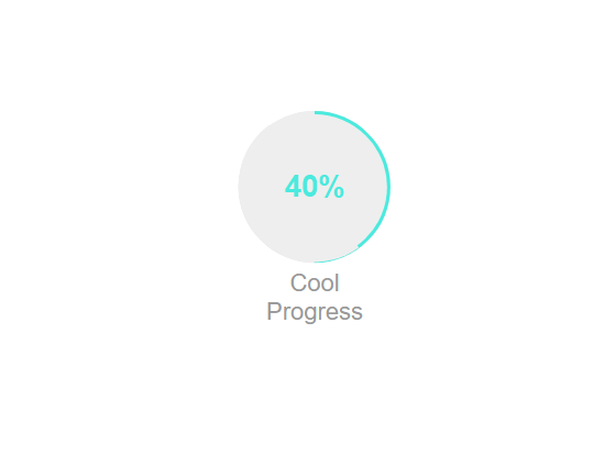
<div class="player">
  <div class="player-icon"></div>
  <div class="progress">
    <div class="right-side"></div>
    <div class="left-side" style="transform: rotate(189deg)"></div>
  </div>
  <div class="player-text">40%</div>
  <div class="player-title">Cool Progress</div>
</div>
Or use javascript to set the values:
var players = document.getElementsByClassName('player');

setProgress(.4, players[0]);

function setProgress(ratio, player) {
    var leftSide = player.getElementsByClassName('left-side')[0];
    ratio = ratio % 1;
    var rot = 45 + ratio * 360;
    leftSide.classList[ratio > .5 ? 'add' : 'remove']('fill');
    leftSide.setAttribute('style', 'transform: rotate(' + rot + 'deg)');
}
And your done!
Full example:
See the Pen Pure CSS Progress Circle by sempostma (@Afirus) on CodePen.
Animation example:
See the Pen Animated CSS Progress Circle by sempostma (@Afirus) on CodePen.
Pie chart example:
See the Pen Pie Progress CSS by sempostma (@Afirus) on CodePen.
Live example: http://esstudio.site/tana-soundboad/.
Resources:
InformIT
eBook Store
has a large number of ebooks on a wide range of topics. I would definitely recommend them.
Great courses:
Quickstart
offers a large amount of (online) courses on web development (Use
Code LSOFF50
to get 50% off ;p)